Rakuten Advertising Brand Materials
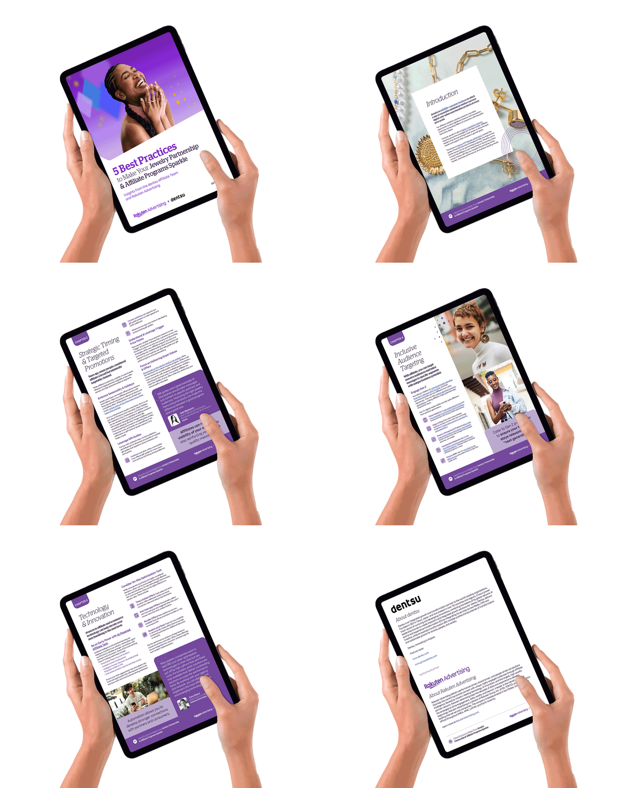
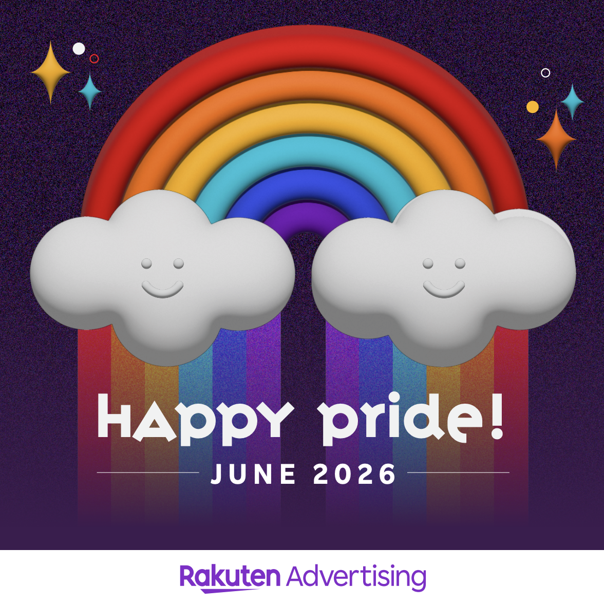
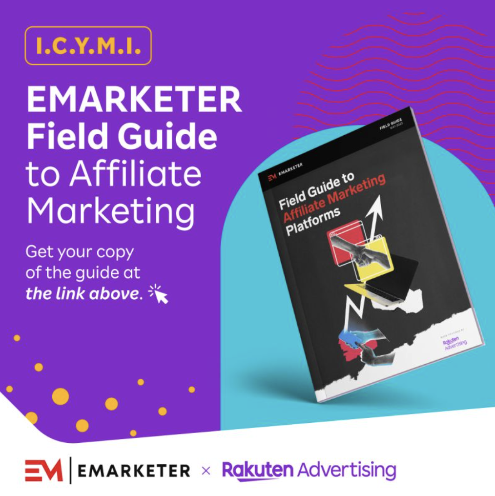
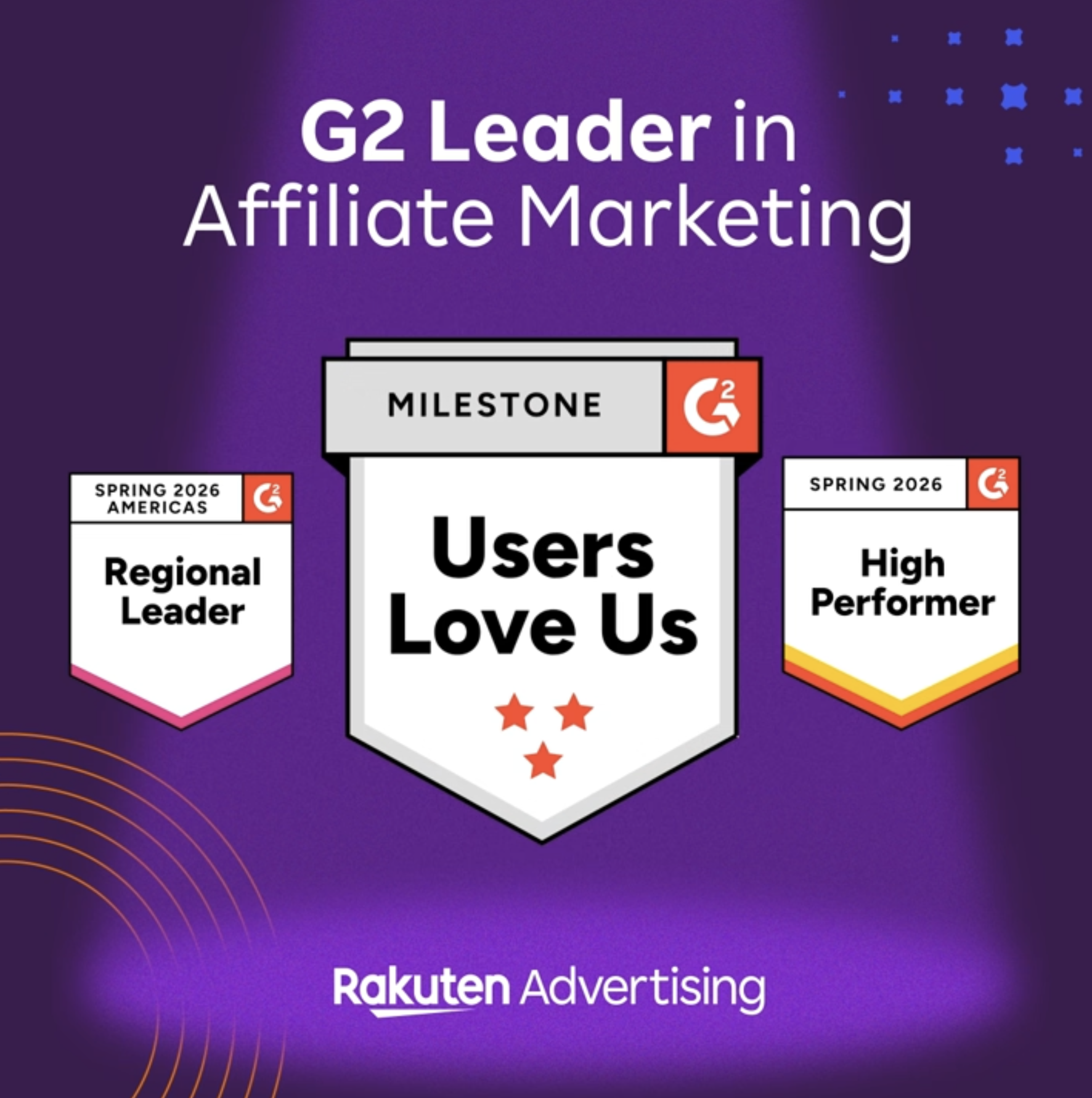
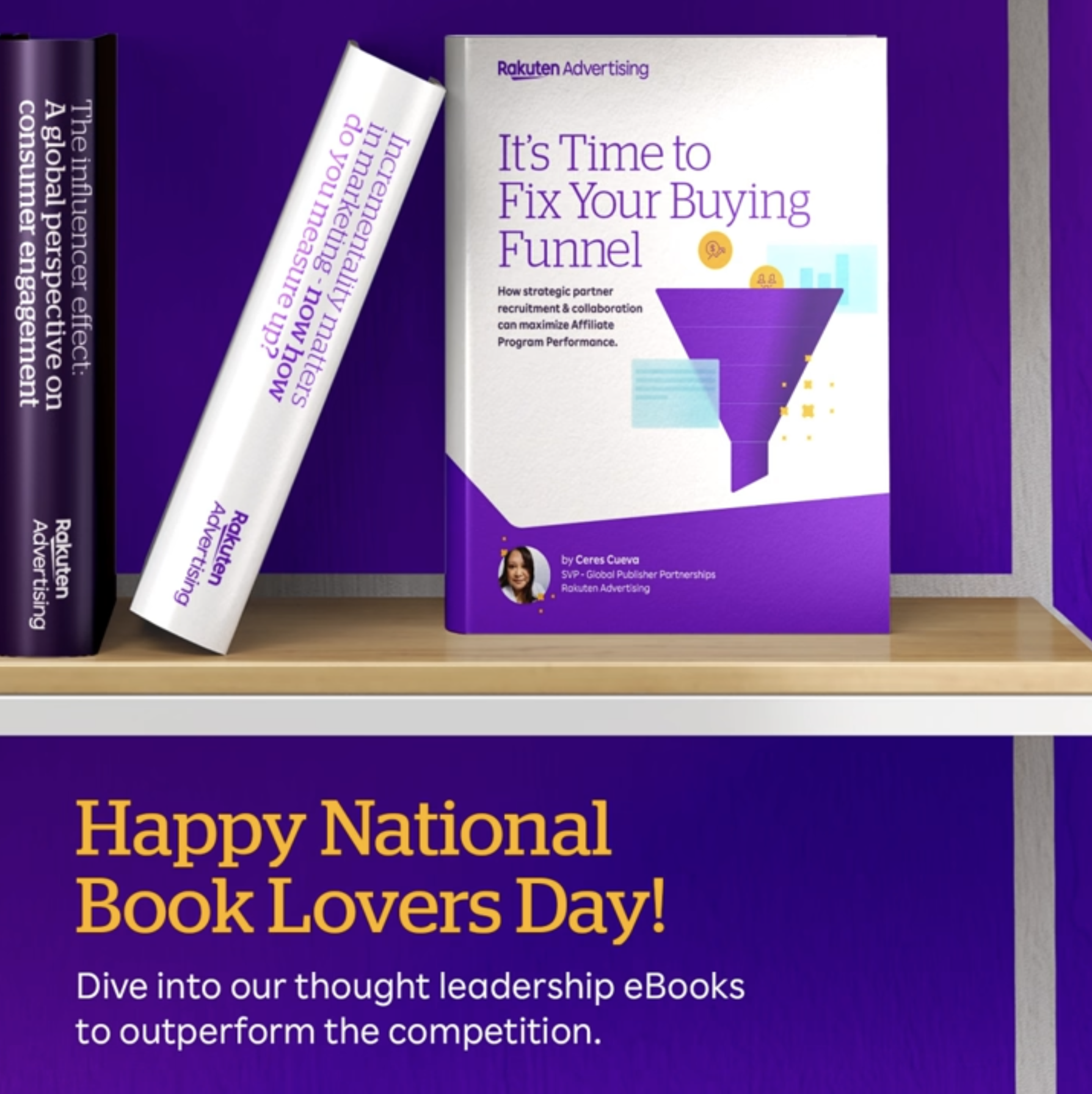
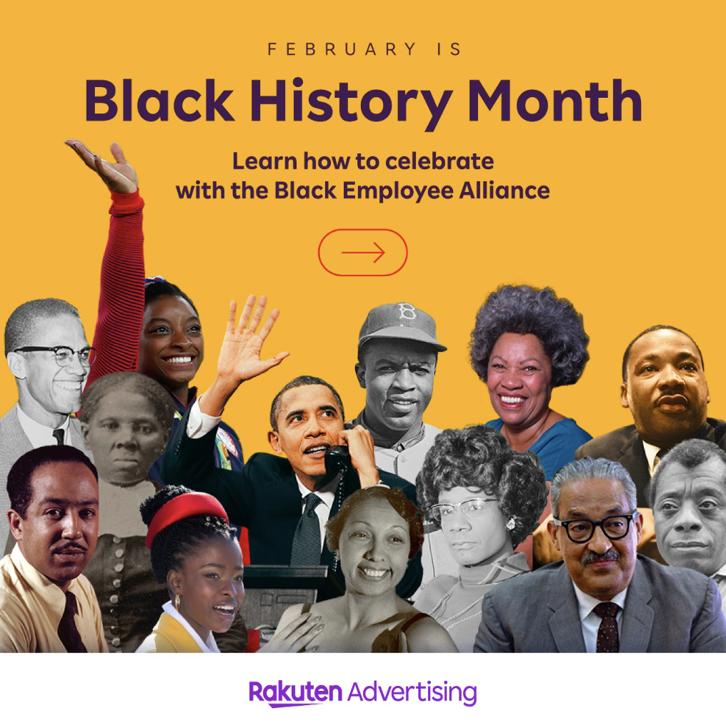
As the leader in affiliate marketing, Rakuten Advertising has a name to uphold, a vision to see through, and a plan to nurture and grow through its brand exploration and identity. From monthly newsletters to advertisers and publishers to events with hundreds of attendees, the brand expression has to work across channels from the more formal to playful, requiring the creative team to stay flexible and adaptable. We’ve explored the look and feel developed for Rakuten Advertising and grown it through paid and organic social, digital banner ads, E-books, presentation decks, an always-evolving website, animated videos, in-person booth designs, countless emails, global event identities, and a lot of fun swag, while also establishing global campaigns for Cyber Week and the travel vertical across North America, Brazil, APAC, and EMEA.
CONCEPTING - ART DIRECTION - EXECUTION
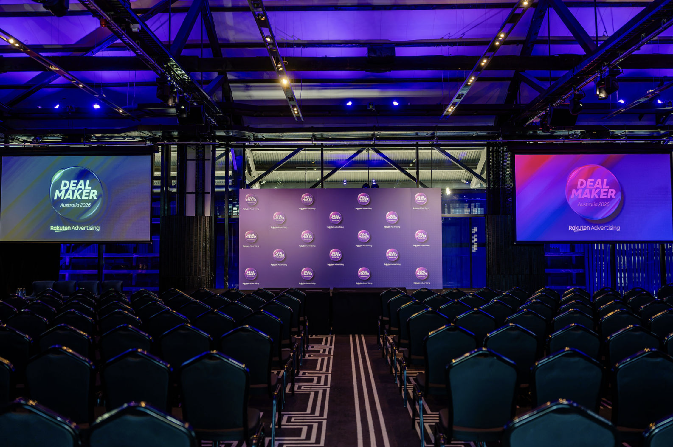
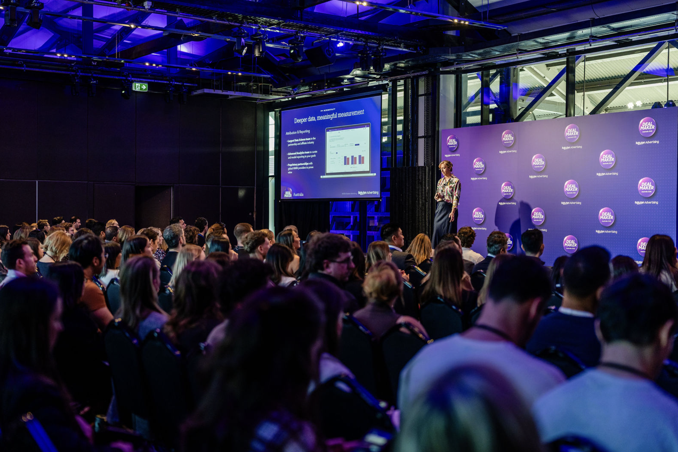
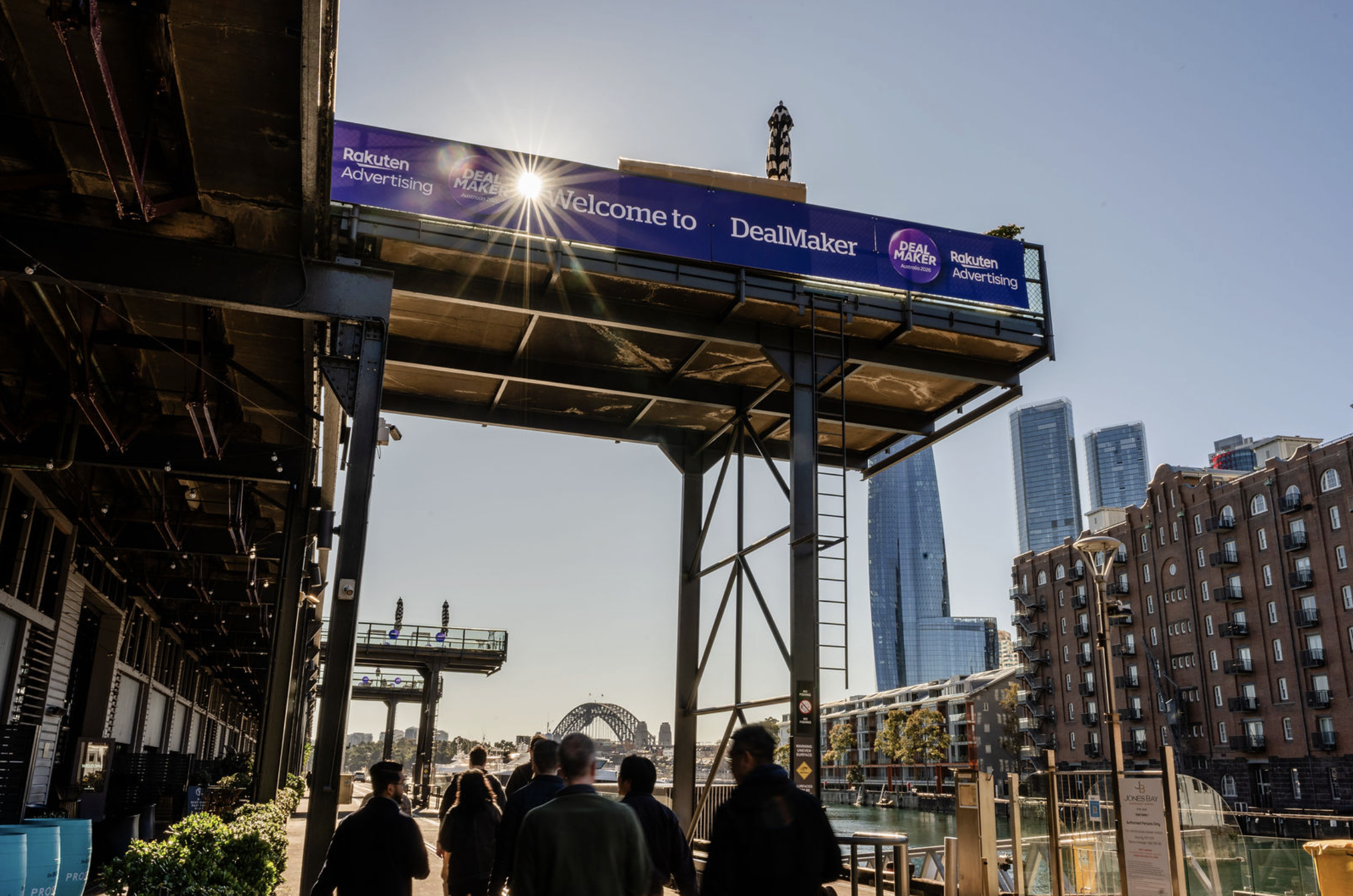
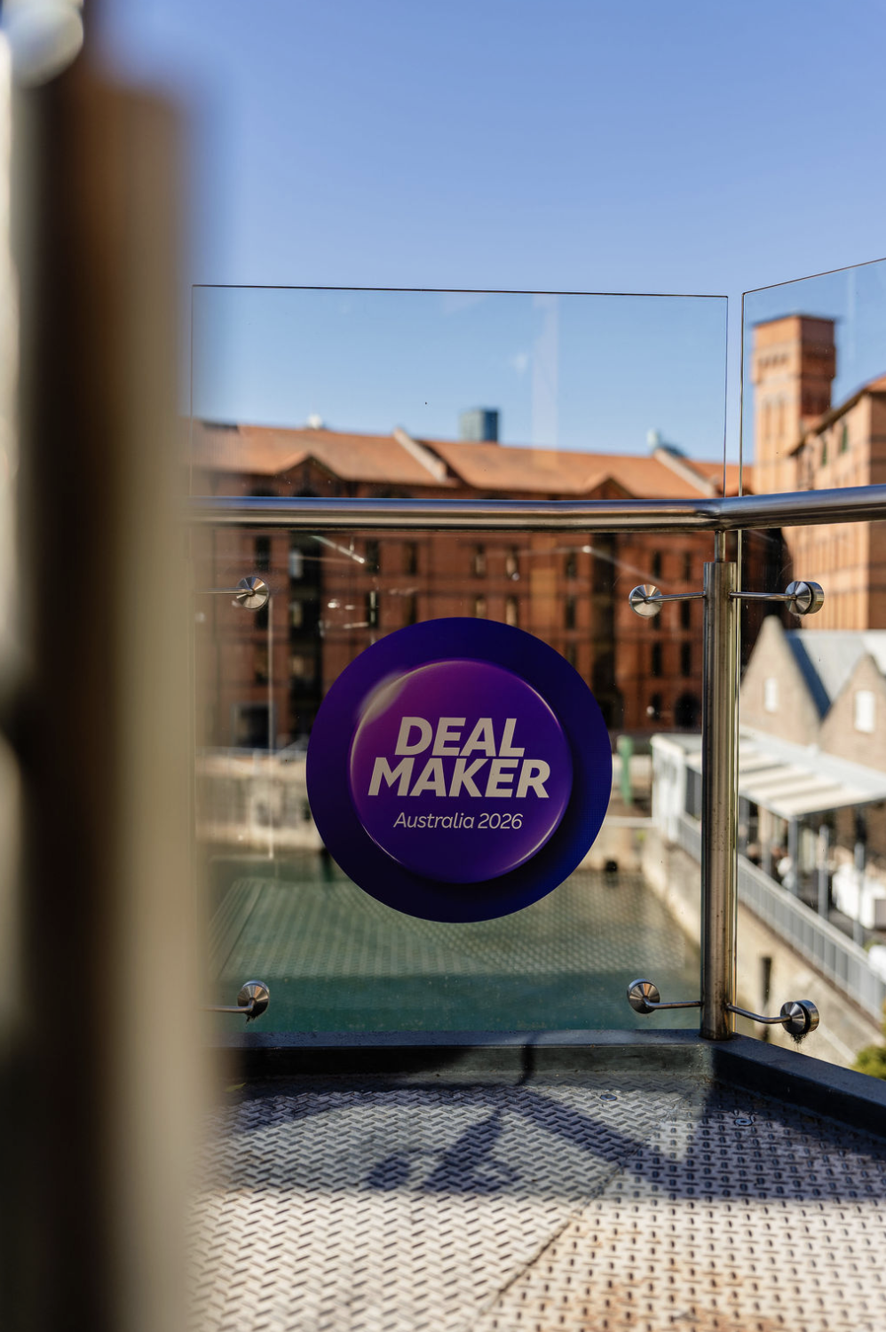
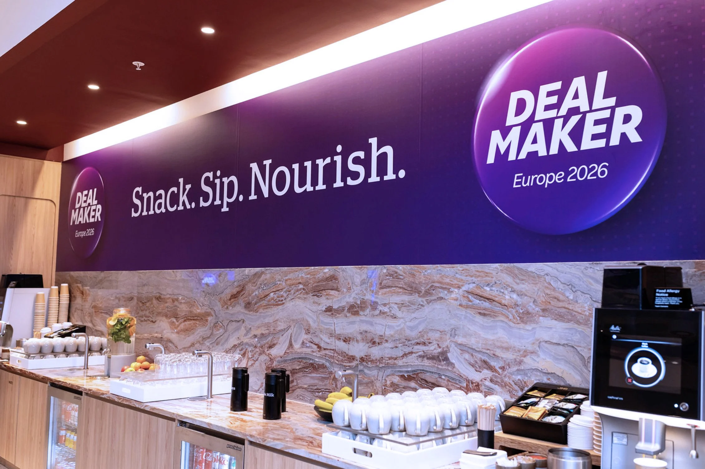
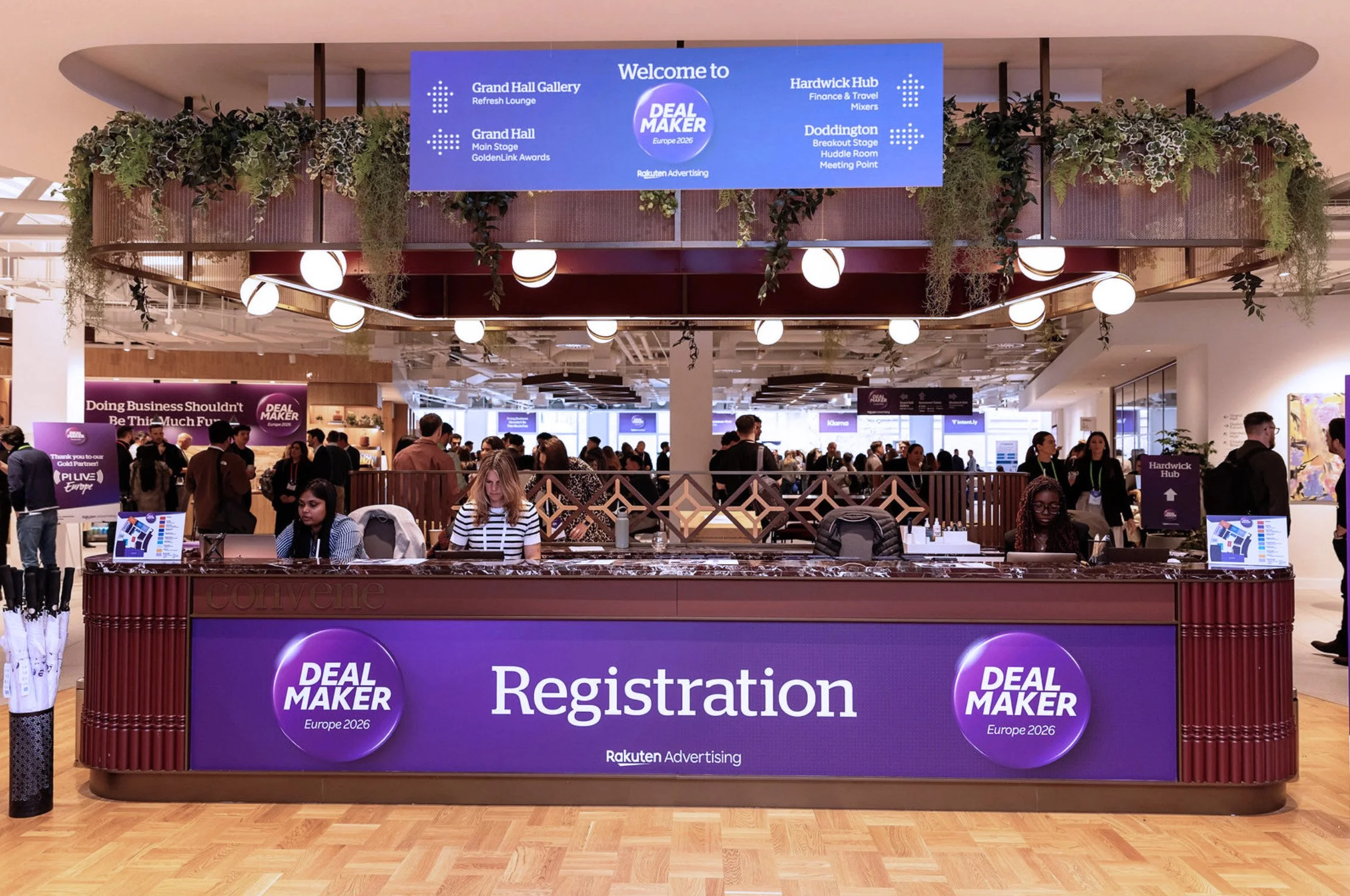
Throughout the year, Rakuten Advertising hosts and attends industry events around the world, including its flagship DealMaker series in Australia, Brazil, Canada, and Europe. Developed entirely by the in-house creative team, the DealMaker brand adapts to each market and venue while maintaining a cohesive global identity. At externally hosted events, we bring that same level of intention to booth design, combining bold imagery, thoughtful messaging, and inviting experiences that give attendees a reason to stay awhile.
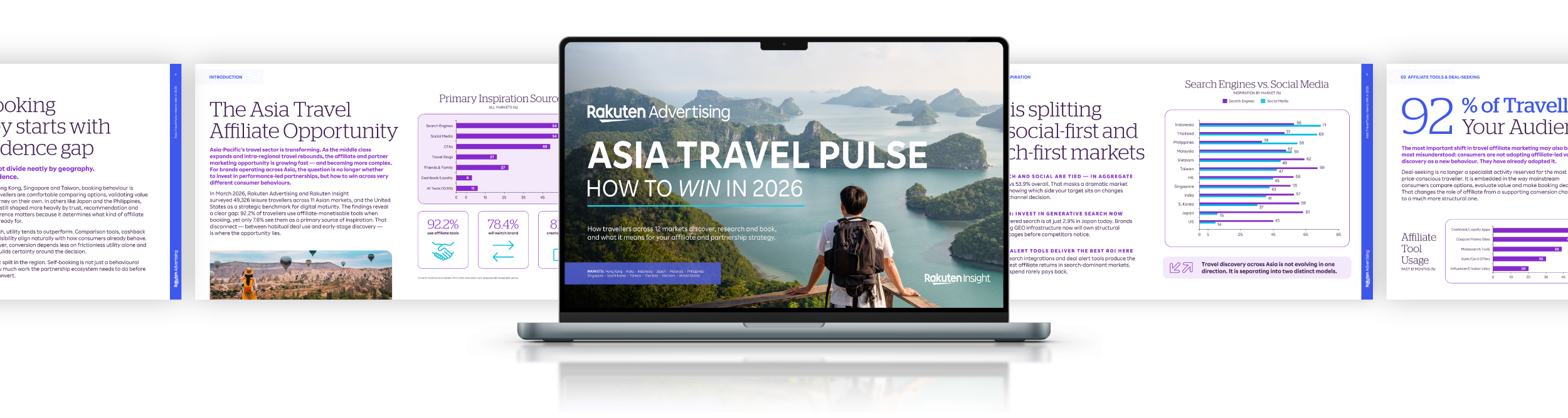
For the Asia Travel Pulse campaign, I designed an insight-led ebook that takes dense research and market data and makes it into something clear, engaging, and easy to navigate. The campaign has its own travel-focused identity, but still feels distinctly Rakuten Advertising through its purple and blue palette and subtle use of our “razzle dazzle” graphic elements. It’s an example of how the brand can flex across campaigns, giving each one its own visual personality while maintaining a clear connection to the larger brand.
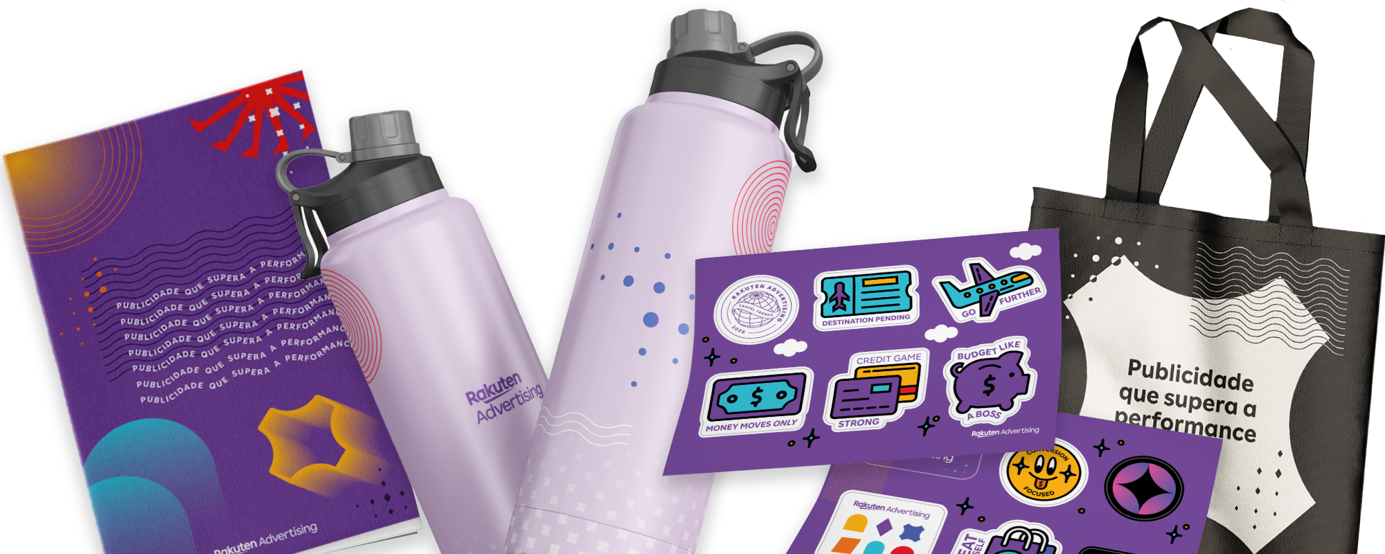
Outside of events and campaign materials, the Rakuten Advertising brand ranges from subdued uses of white and the proprietary mid-tone purple to adding in sprinkles of “razzle dazzle” to take minimalist designs to more playful experiences, showing that advertising that outperforms means meeting the moment in every situation.




CREATIVE DIRECTOR: ELLIOTT WHITESIDE
SENIOR ART DIRECTOR: JOHN QUIJANO
ART DIRECTOR: SARAH LANGSTON